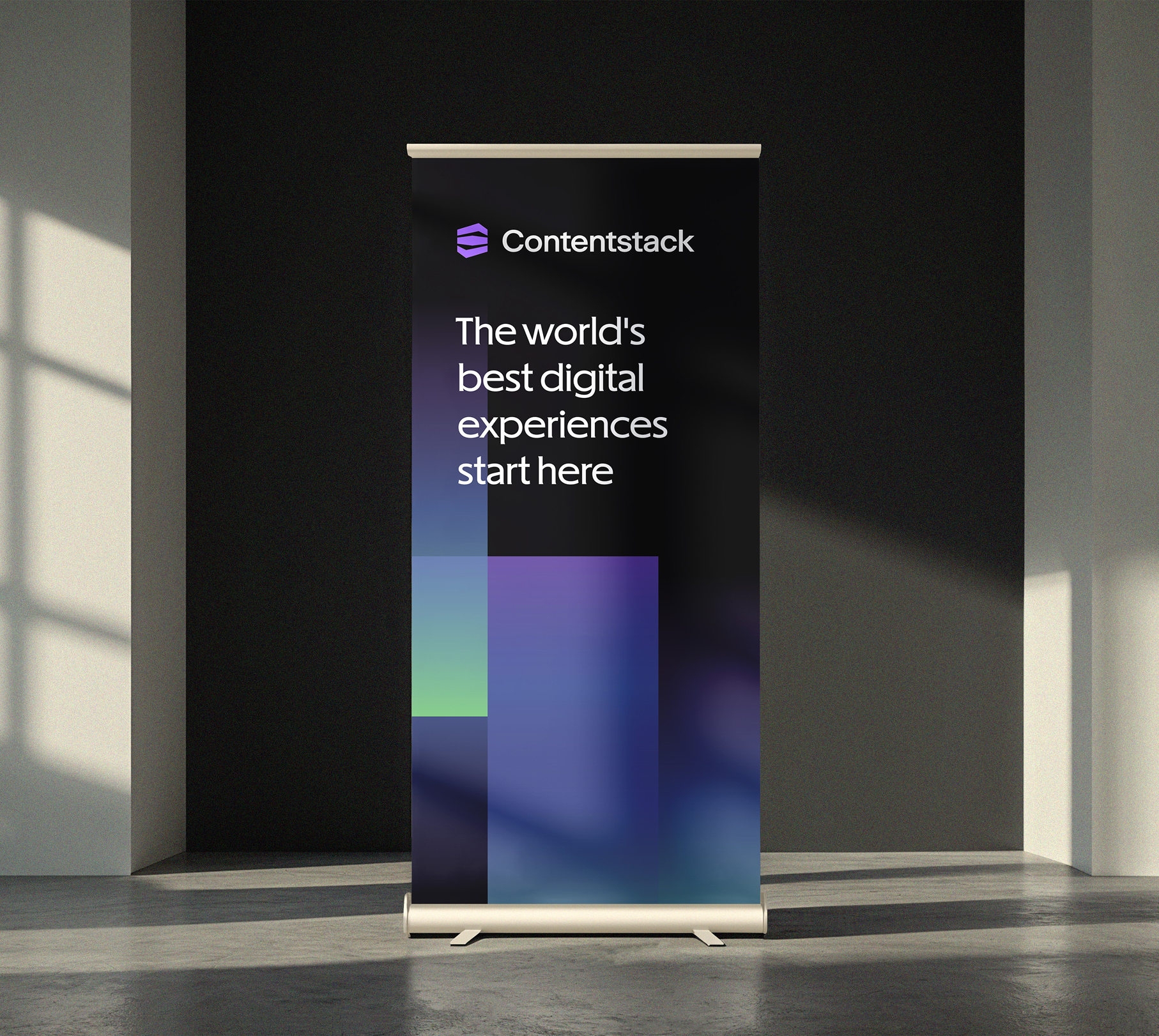
Contenstack rebrand
Contentstack came to the scene as a scrappy startup, disrupting the monolithic CMS space, and their existing brand reflected that. It was time to mature the look and feel, sharpen the brand story, and differentiate ourselves from the CMS pack.
I co-led the rebranding project alongside the Director of Content. We collaborated with our agency partner, Focus Lab, to create the new logo, brand system, and verbal identity. Once the guidelines were set and handed off, I led the implementation across all brand surfaces. The team rebranded in a record 2 months, in time for our user event in London.
Role Creative Director, leading a team of Art Directors, Production Designers, and Motion Designers

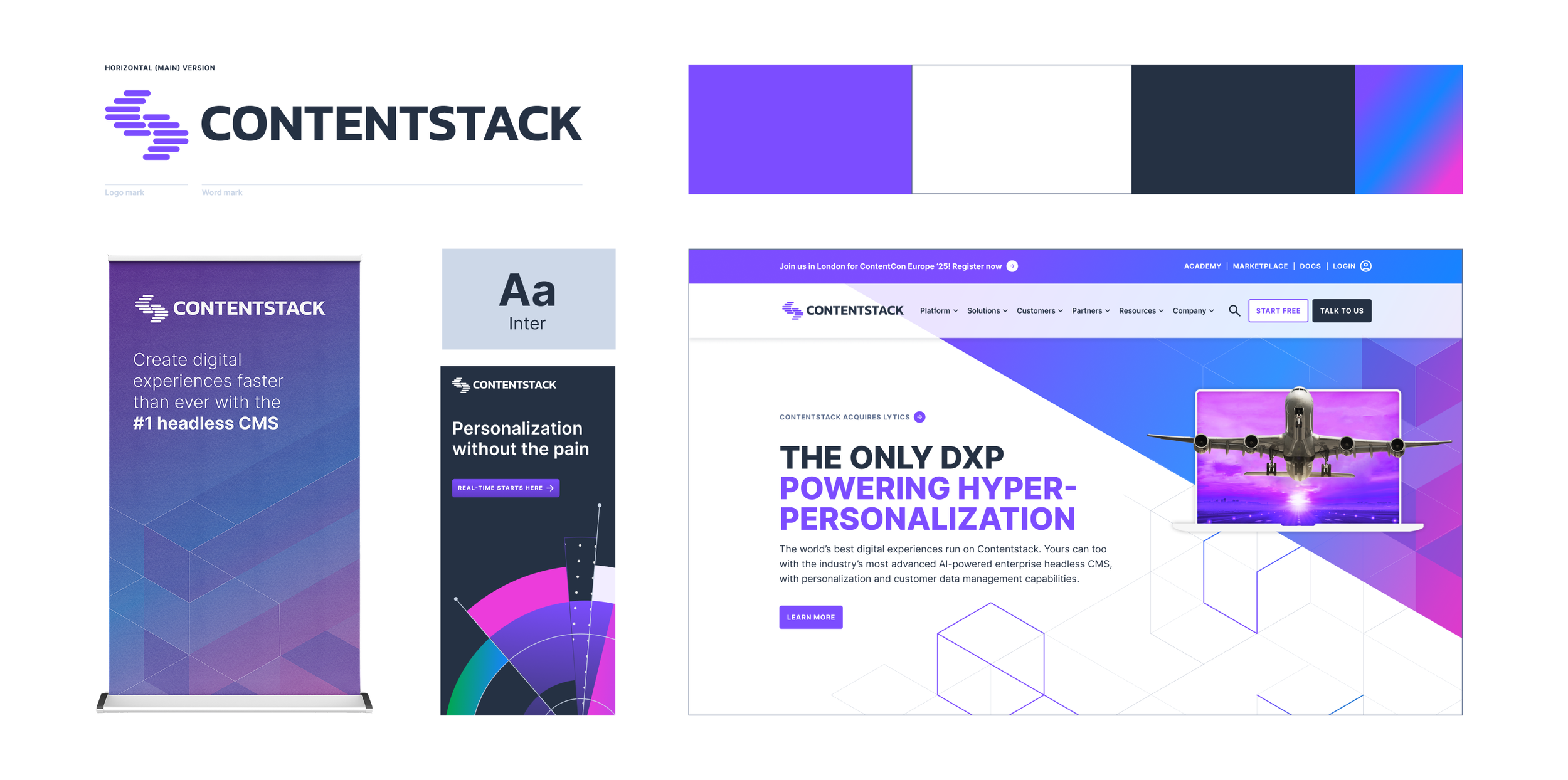
OLD BRAND
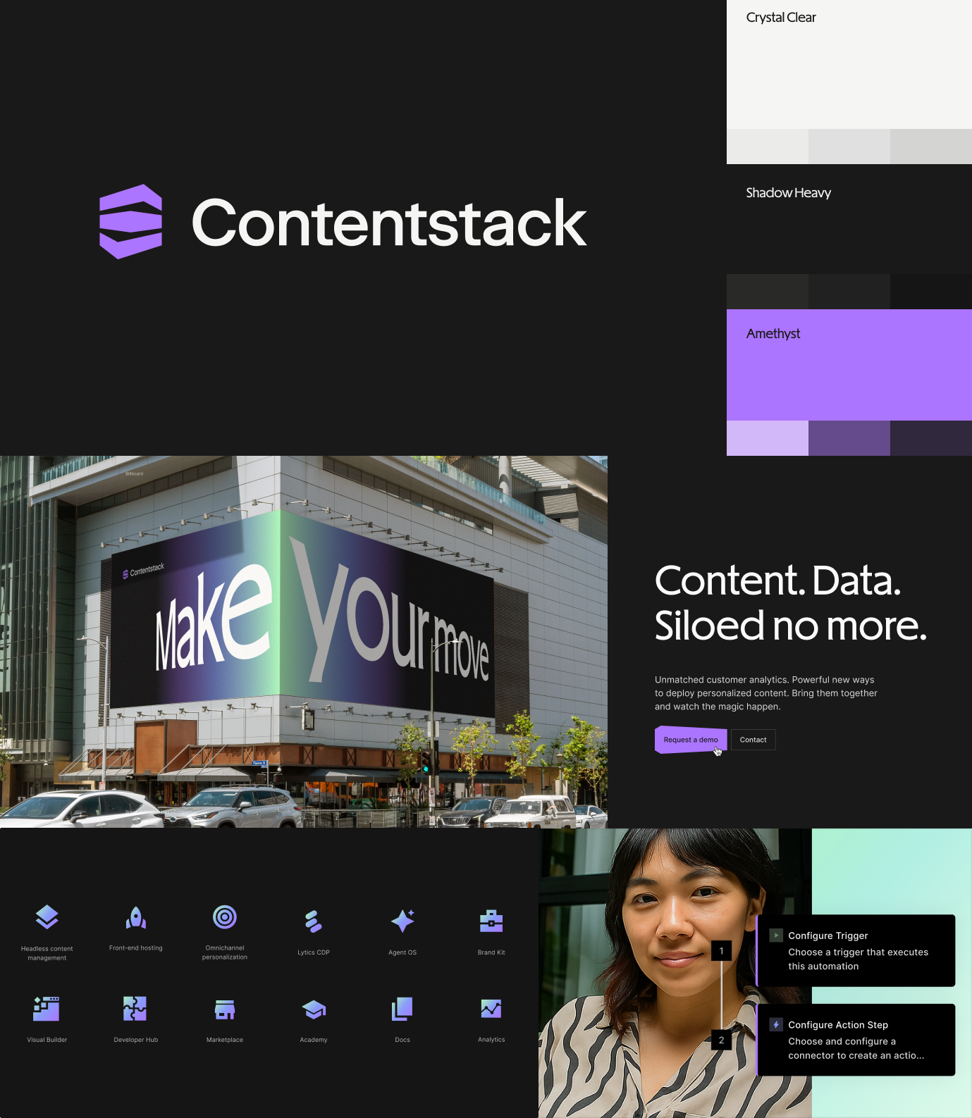
A new brand, evolved from our roots
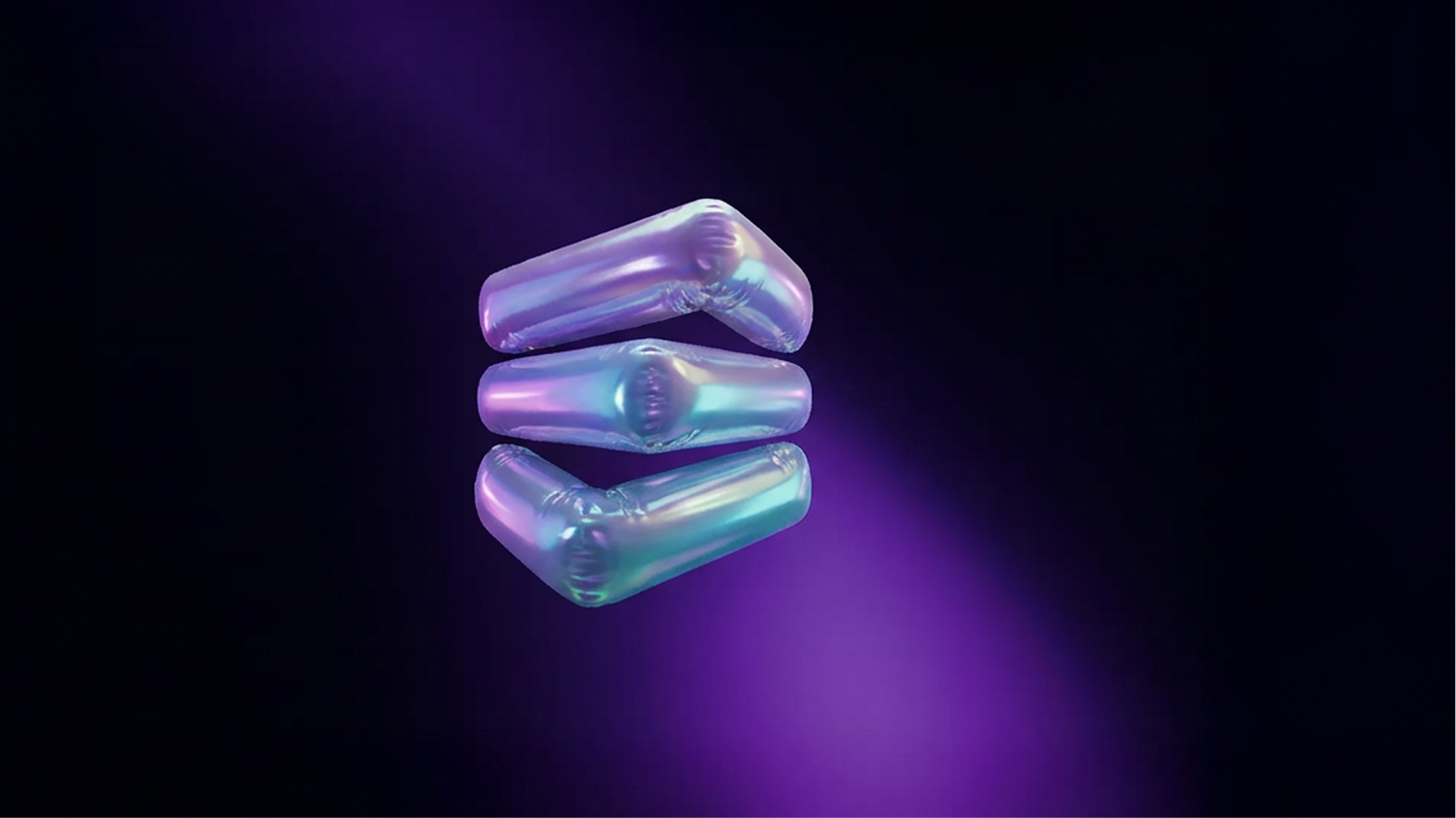
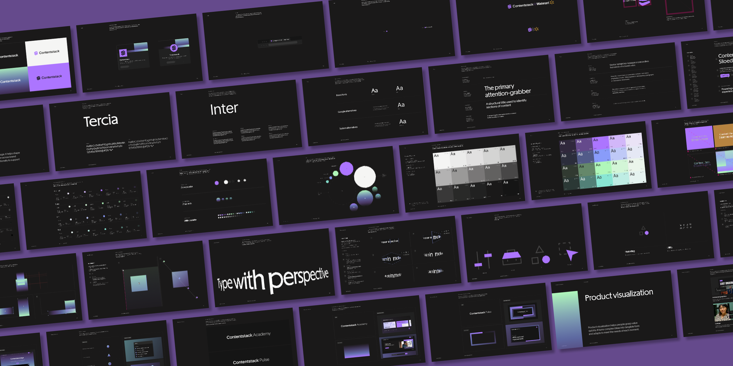
It was important to build on aspects of our brand that resonated with our customers, prospects, and internal team. We built around the primary purple, refining the hue and the rest of the palette to be more grounded in sophistication and modernity. Our logo evolved into a modular, dynamic stack. An elegant, footed serif font, Tercia, replaced the sans serif workhorse, Inter, as the primary typeface.
The newest element, the gradient system, plays a central role in the visual language. Jewel-inspired secondary tones at varying opacities were paired with our royal purple to create a sense of depth and adaptability.
The launch
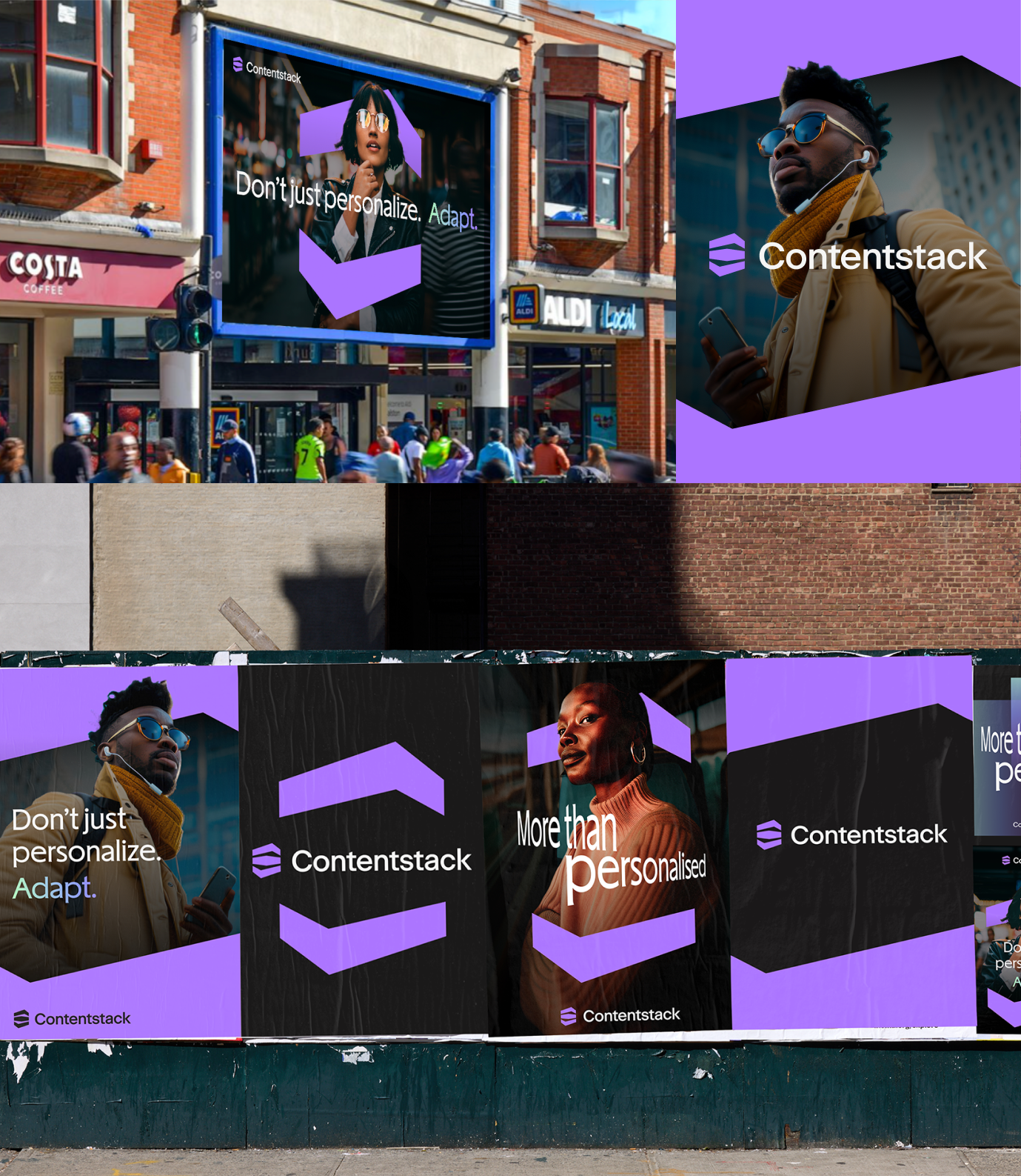
To launch our new look to the world, we created an international OOH brand campaign. What better way to emphasize this new era of Contentstack than to really flex our new logomark. Leveraged as the key graphic element, the stack mark was used as a framing device for messaging and imagery. The campaign executions ranged from in-ride Uber ads to large billboards, like the one featured at Hackney Central.
Reimagined top to bottom
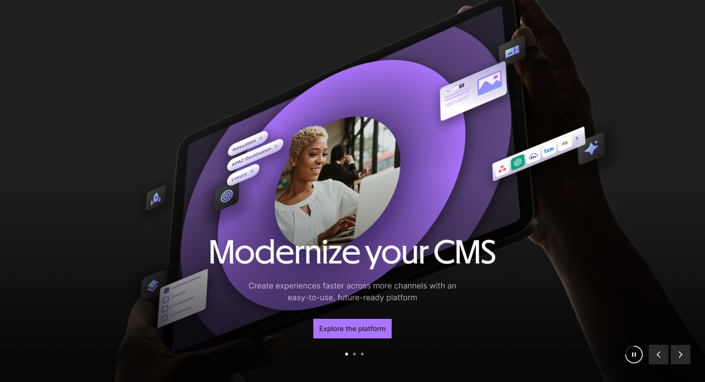
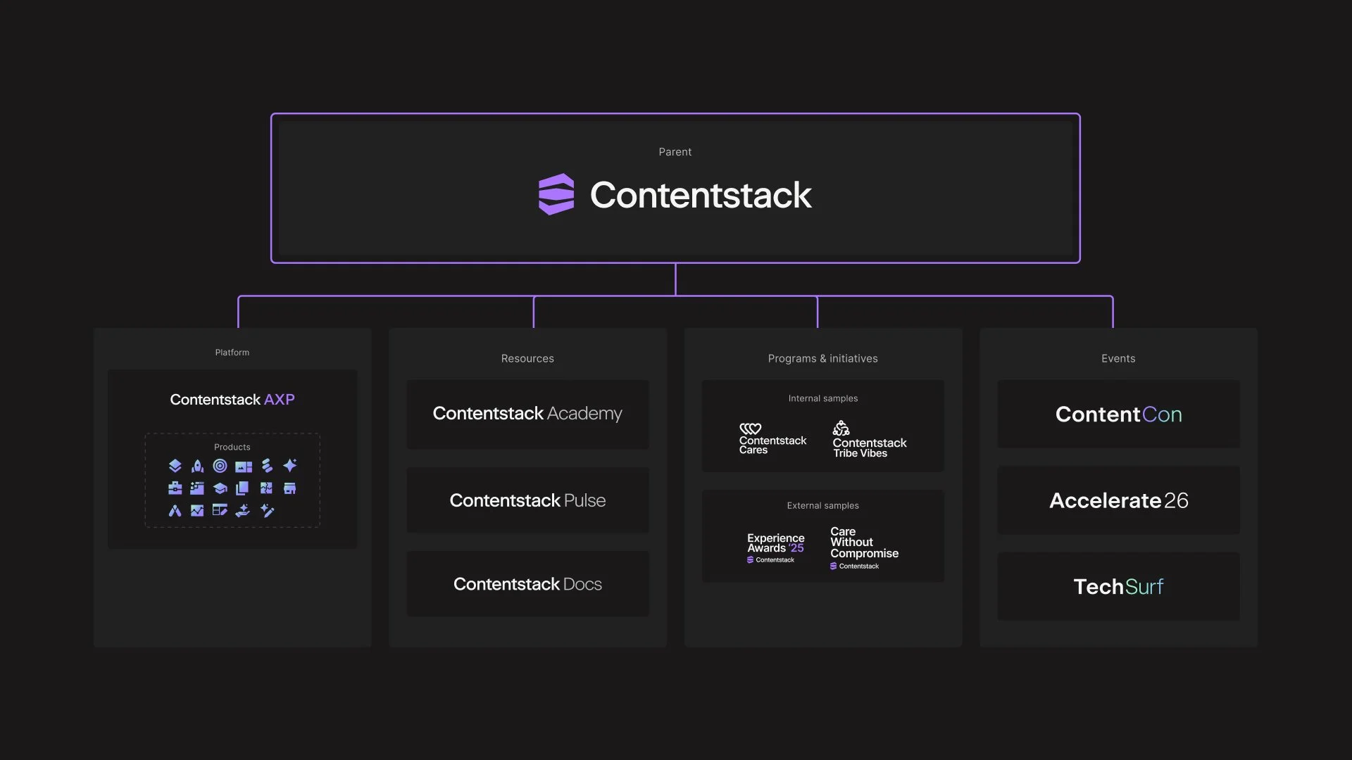
Bringing the brand to life provided an opportunity to redefine every asset. I approached visual treatments from a form and function perspective. Designs needed to not only look good, but they needed to perform, at scale.
Website
Campaigns
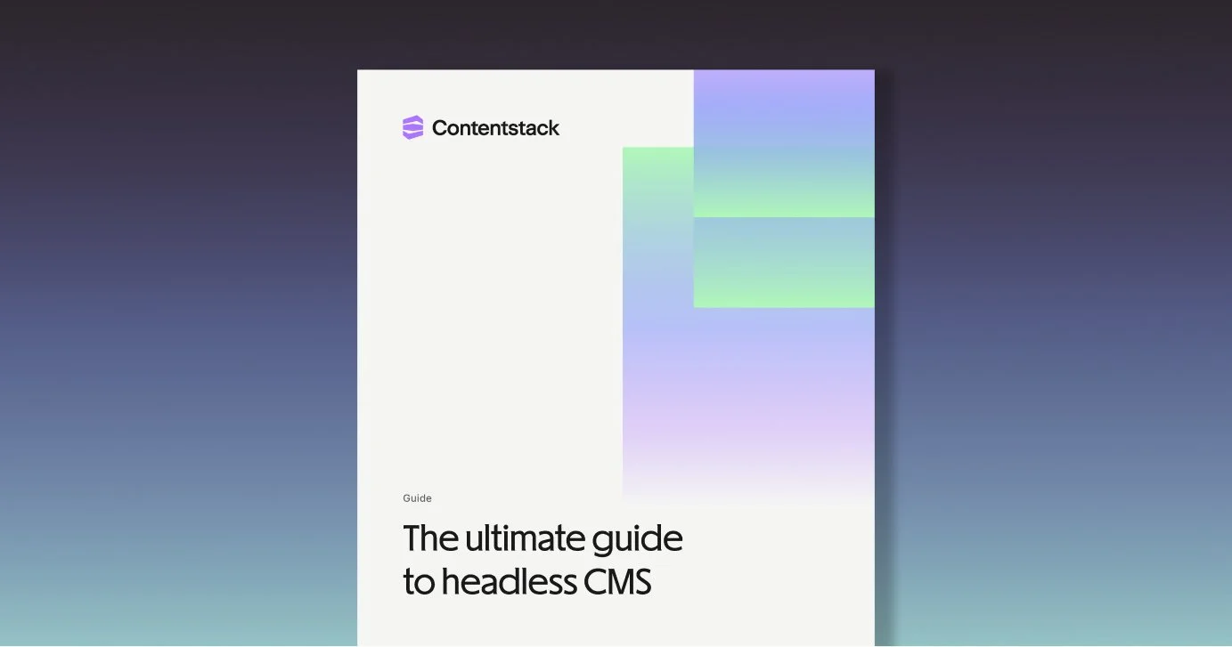
Guides
Videos
Templates
Docs
Product
Icons
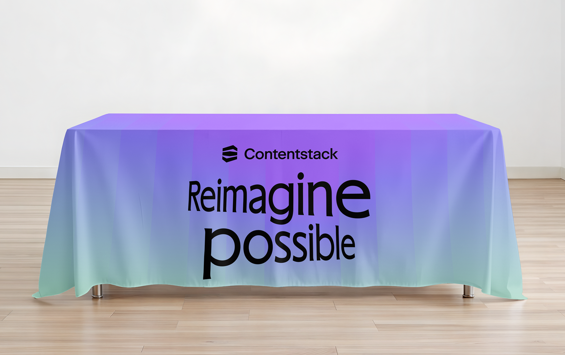
Booths
Swag
Academy
Events
Website Campaigns Guides Videos Templates Docs Product Icons Booths Swag Academy Events
![CS-newsletter-customer [1200x600]- copy example.jpg](https://images.squarespace-cdn.com/content/v1/58853b2b893fc0ce70701aed/62c89c79-d619-420d-9589-7615a700210a/CS-newsletter-customer+%5B1200x600%5D-+copy+example.jpg)